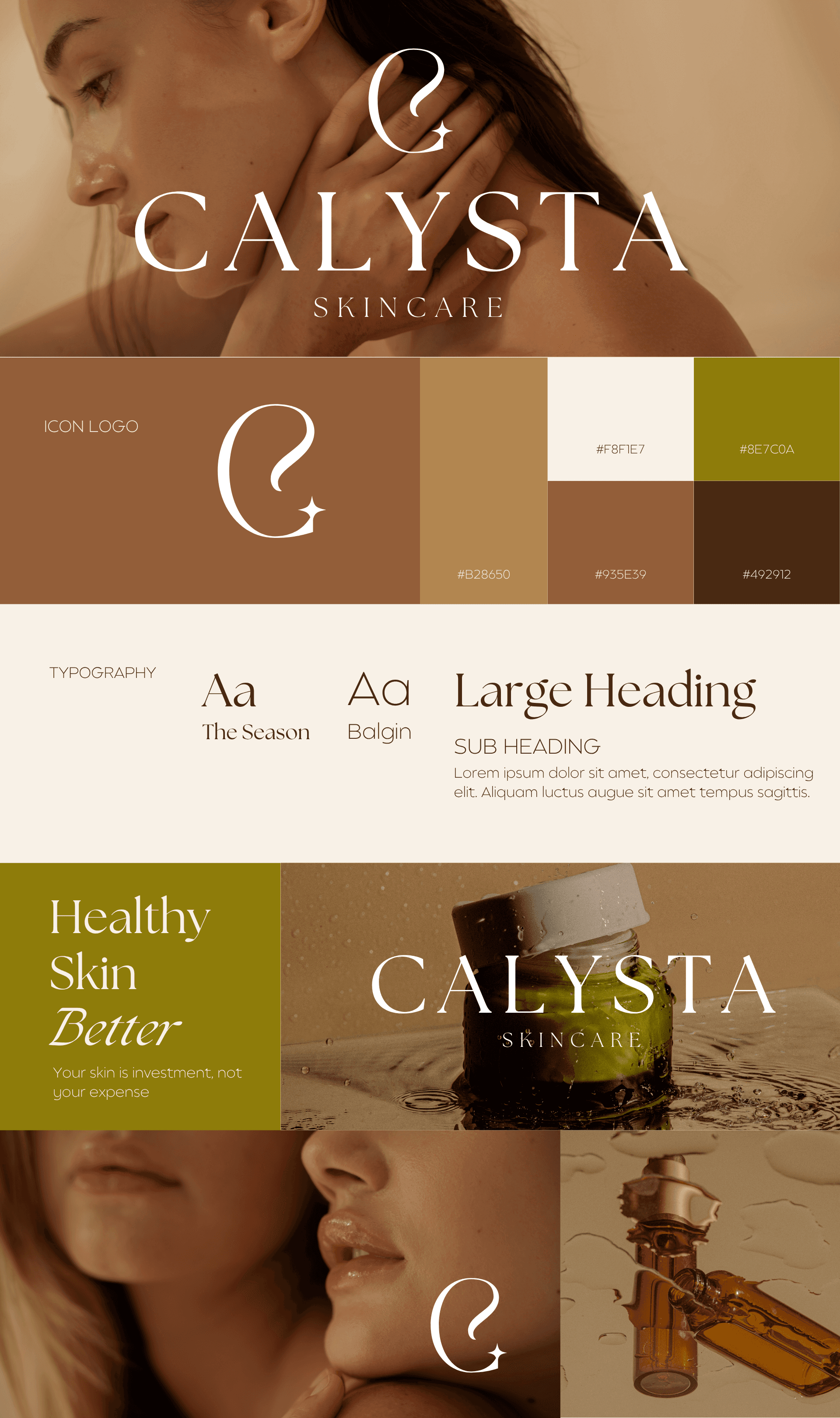
Calysta
calysta
Skincare
Project Objective
To create a premium, nature-rooted brand identity for Calysta Skincare, a brand harnessing the ancient healing power of sandalwood. The goal is to position Calysta as a luxurious yet earthy skincare label that appeals to conscious consumers who value natural ingredients, timeless beauty, and inner radiance. The identity aims to instill trust and wellness while highlighting sandalwood’s rejuvenating benefits.
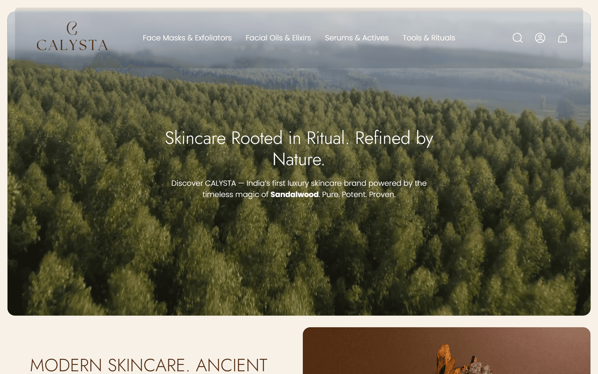
Website Preview
Design Thought
The branding for Calysta is built around a balance of natural purity and sophisticated elegance. The custom icon logo, resembling a droplet and leaf fusion with a subtle sparkle, signifies nourishment and glow. The typography—a mix of ‘The Season’ and ‘Balgin’ fonts—adds a refined, editorial tone that elevates the visual storytelling.
The earthy color palette—rich sandalwood browns, soft creams, and olive greens—evokes nature and warmth while maintaining a high-end feel. Imagery direction focuses on glowing skin, minimal textures, and close-up beauty, emphasizing "Healthy Skin is Better" and positioning the brand as a skinvestment (skin + investment).


